2.10.2010

Funnel Master T shirt Design


Client- Kit Designer
Brief- Design a T shirt as a prize for a Drinking competition.

The competition was entitled "The Funnel" and the winner crowned "Funnel Master", So I used this as the basis of my design concept.

The inspiration for this piece was Karate Competitions, winners and the gold place, beer funnels and spillage.
Key Features include the karate style silhouette, the funnel itself and the word master being made from a pipe used for the funnel
Colours were kept within a yellow gold range to tie in with 1st place&gold. Black and grey break up the piece and add depth.

Walkers Point of Purchase Display unit.


Client- Walkers crisp
Brief- Design an in-store P.O.P. (point of purchase) that places emphasis on the home grown potato side of crisp manufacturing.

Inspiration- all things natural and bright.

for the in-store display I made my piece from cardboard. Cardboard can be easily flat-packed, it is light and recyclable. One would fit more onto the back of the lorry for shipping and distributing, which in turn would mean less vehicles needed which would reduce the overall carbon footprint for the company.

all the illustrations on the display are vectorised, which means that the display could be resized and the quality of the images would not depreciate. the front of the tiers have a potato as the flavour indicator. The sides display a range of nature and farming images in earthy browns greens and yellows. The logo on the backboard acts like a sunrise over the farm (that is the display). Wobblers (pieces of graphic printed onto card and attatched to the main display by means of a clear narrow line of transparent plastic) are placed around the logo to entice children to get their parents to buy the goods for them.

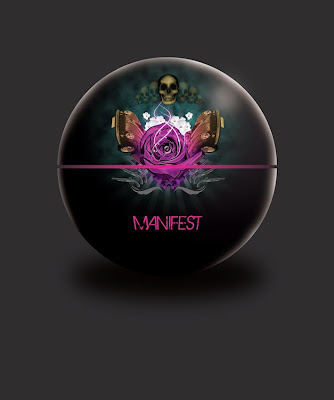
manifest illustration


This was an illustration that I did as a concept for a men's product range entitled Manifest.
The Graphics were chosen for the every growing popularity in packaging with illustration, my target market for this project was the modern male metrosexual, i thought it fitting to add flares of dramatic pink and gold. traditionally associated with femininity. Guns, roses skulls and fast cars were used in this piece to make sure that there was little to no mistake that the product is fashionable yet manly.

Private View Party Poster and Tickets


A collaboration with Designer Claire Davies.

Design used to advertise an exhibition and after party at West Wales School of the Arts.

CMYK process colours used to subtley reinforce the design faculty, a faculty that I hold close to my own heart.

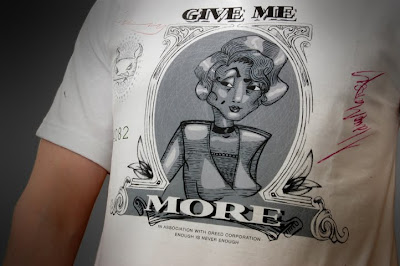
T Shirt Design


T shirt print Designed as merchandise for an RPG computer Game.

Greed is one of the characters in the game, I thought it appropriate to do print based on money and capatalism. Taglines such as "enough is never enough" and "in association with greed corporations" embelish the design.

2.09.2010

Connected Scotland


Resource Advertising Event in Edinburgh, Scotland.
Corporate colours were used as a basis of inspiration, the poster is text heavy to keep the poster ambiguous, Graphic Elements such as the lines and sticker effect give the piece some substance.